
Complete usability analysis of the job search user flow on Indeed.com
My team and I were tasked to complete a usability analysis of the Indeed.com website. After conducting a thorough heuristic evaluation of the entire site, we chose to focus on the job search user flow. In order to obtain objective & useful insights, we decided to conduct usability testing of the job search user flow on Indeed, LinkedIn and Glassdoor, and have participants compare and contrast their experiences on the three different sites. Our final deliverable was a slide deck explaining the process and making informed recommendations and improvement suggestions to the UX director of Indeed.
Process
Heuristic evaluation
We evaluated the entire Indeed site for its functionality and usability according to the Nielsen Norman group’s 10 Usability Heuristics for UI design. This helped us identify a suitable user flow that required further testing, which in this case was the job searching user flow.
Usability Testing
Moderated usability testings of Indeed and competitor sites Glassdoor and LinkedIn were conducted over Zoom. During the testings, participants were directed to fill out System Usability Survey (SUS) questionnaires, and were asked verbal questions to obtain qualitative and quantitative data for analysis.
Data analysis
After data collection, we first performed statistical data analysis of the quantitative data obtained during the testing, both from SUS questionnaires and task completion timings. We also analysed the qualitative data provided, by creating an affinity diagram of insights and feedback obtained during usability testing. This helped us gain a clearer picture of any flaws or pain points experienced during the user flow.

Heuristic evaluation
The goal of completing this heuristic evaluation of the Indeed.com website was to identify potential usability problems across the site, and in doing so single out a user flow that would require further usability testing. We followed the Nieslen Norman group (NNg)’s 10 Heuristics for UI Design, rating each aspect of the site from a color coded scale of 0 (positive instance of heuristic - no solution needed) to 4 (critical usability problem, should be addressed ASAP).
Following our heuristic evaluation (shown below), we identified positive findings as well as suitable areas of improvement, and made several preliminary recommendations. After finding out that a lot of our more severe usability violations occurred on the keyword search page and the search results page, we decided to focus on the job search user flow for user testing.

Heuristic evaluation of Indeed.com
Usability testing
After deciding on a specific user task flow (job search using keyword bar), we started the next stage of our project, which was usability testing. The purpose of our usability testing was to:
Evaluate the efficacy of the Indeed site design and its different elements based on user success while using the keyword search bar to look for job opportunities
Find out there are any addressable user experience flaws (pain points) at each step of the job searching process that can be remedied
Create a repeatable usability study protocol
To better quantify the results of our usability testing, we decided to come up with five research questions that our test needed to adequately answer in order to be deemed successful and productive:
How quickly are new users able to successfully arrive at the job opportunity that they are directed to search for?
Do new users need external guidance to navigate the Indeed site and successfully complete the assigned tasks. If so, to what extent and what kind of help?
What mistakes do users make while completing the assigned task flow?
Whether there would be new site features implementable that would make sense to current users
Which elements of the current Indeed site cause user confusion while job searching and how can they be improved?
In order to obtain objective insights about aspects of the job search task flow on Indeed.com, we decided to have participants complete the same task on competitor sites Glassdoor and LinkedIn in addition to Indeed. We gave participants a user persona to find a job for, and requested that they find a job fitting as many of the persona requirements as possible. Participants were asked to finish this task on the three different sites, completing a SUS questionnaire and answering verbal questions in between each task.
Qualtrics screener survey
Participant screening
After identifying our user flow, we started usability testing by first creating a screener survey using Qualtrics in order to identify suitable participants. Qualtrics was able to implement display logic such that we were able to obtain contact details only for survey participants who fit our user testing requirements. For our purposes, we identified participants actively looking for job opportunities who were not using Indeed.com as their main job-hunting site. We categorized our users into students and non-students, because they would have slightly different priorities and thus search behavior compared to each other.

Test script for moderators’ reference
Designing the test
While survey collection was ongoing, we worked on a comprehensive moderator script that laid out the entire process step-by-step. This would facilitate testing by guiding us moderators through user testing.
The outline of the test is as follows:
Give the participant an overview of the usability testing and tasks to be performed, collect consent and start recording
Perform tech checks on participant equipment
Administer tasks & take notes regarding participant behavior/body language

User persona given to participants
Usability testing
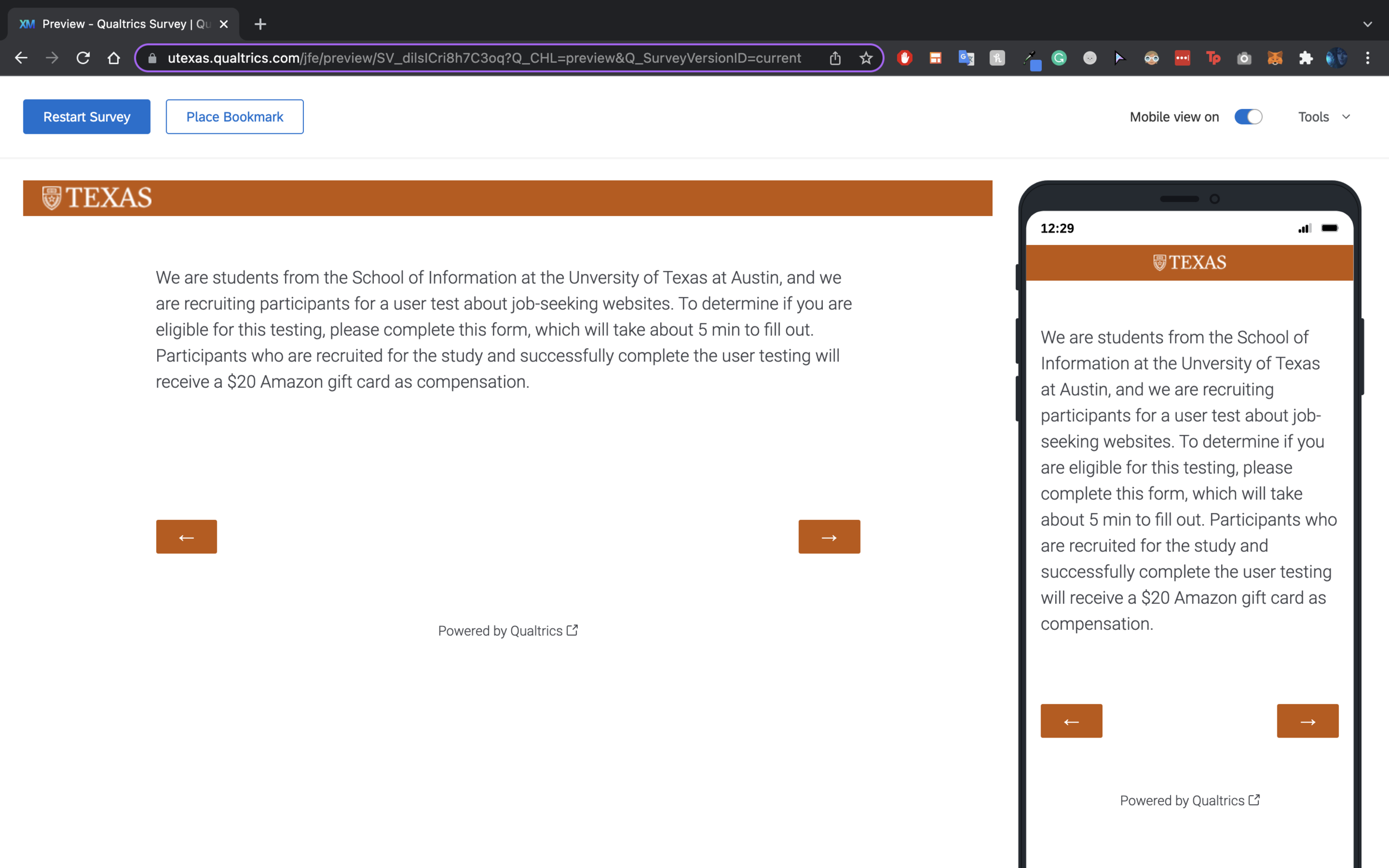
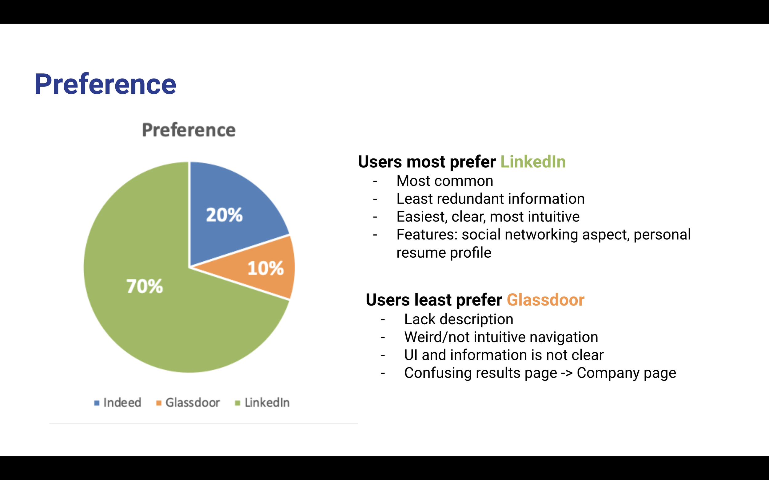
After briefing the participant on the overview of the testing, a tech check was conducted before the actual testing commenced. During testing, participants were given seven minutes per website to search for a job (non-student) or internship (student) that met the requirements of the given user persona, such as location preference, skillset, education level etc. They were instructed to notify the moderator once they had completed the task to their own satisfaction. Participants were informed once there was a minute left on the clock. Afterwards, participants were given an SUS on the website to complete, then asked several more verbal questions in order to capture qualitative data that the SUS would not be able to. This process was repeated three times, once per site. At the end, participants were asked a series of verbal questions comparing their experiences on each of the three sites so that we could figure out what the ideal user experience was and make recommendations to Indeed accordingly.
Data analysis
After testing was done, we had acquired qualitative and quantitative data depicting participants’ performances, thoughts, and opinions on each of the three sites as well as in comparison to one another. We performed data analysis on both the qualitative and quantitative data in order to gather complete insights, which we will base our recommendations to Indeed on.

Affinity mapping
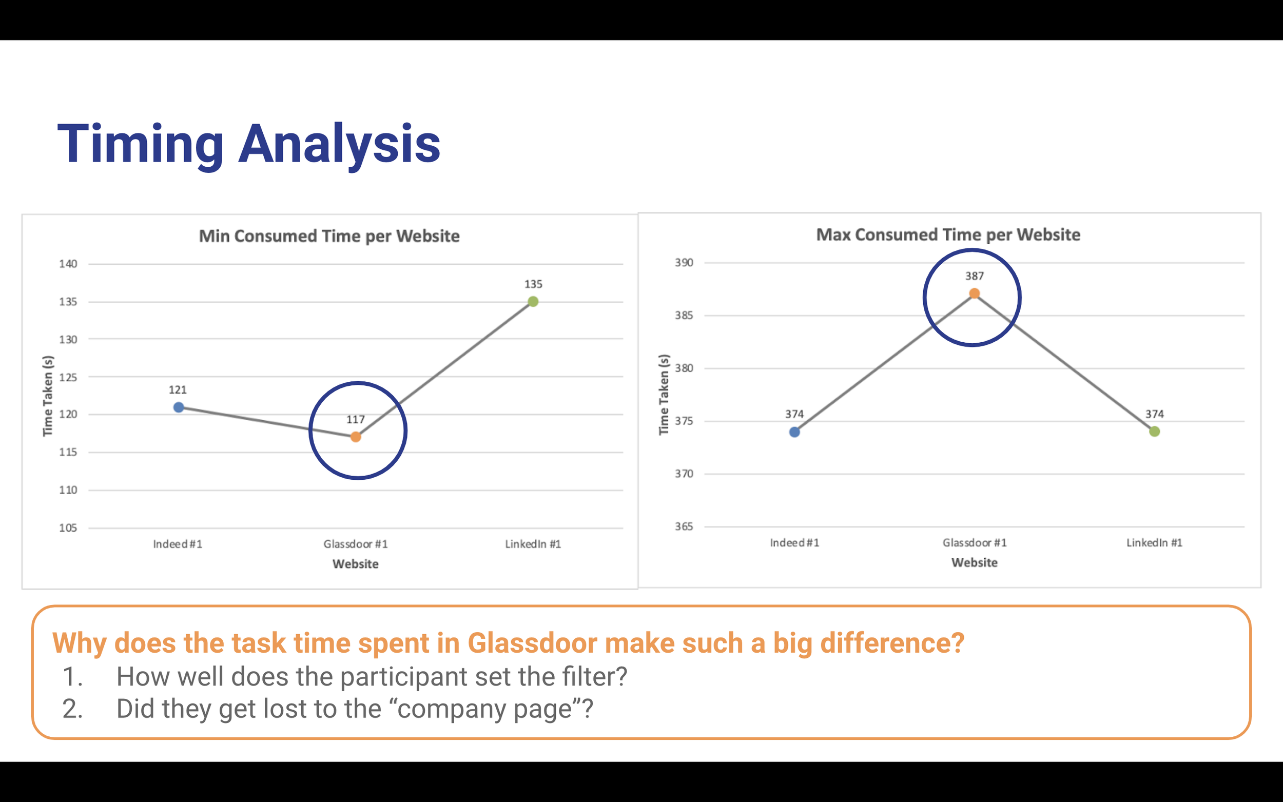
In order to better understand the qualitative data gleaned from usability testing, we decided to create an affinity map from the notes we took during testing. We categorized feedback into the three different sites to find common pain points expressed by participants. For Indeed-specific feedback, we further divided feedback into three categories - “to be improved (filters), to be improved (others) and doing well”. We realized that users experienced frustration and confusion using the filter function on Indeed, and our affinity mapping reflected that. Lastly, we found quite a bit of commonality when participants were asked to compare the three sites to one another, which was also reflected in our affinity map accordingly.
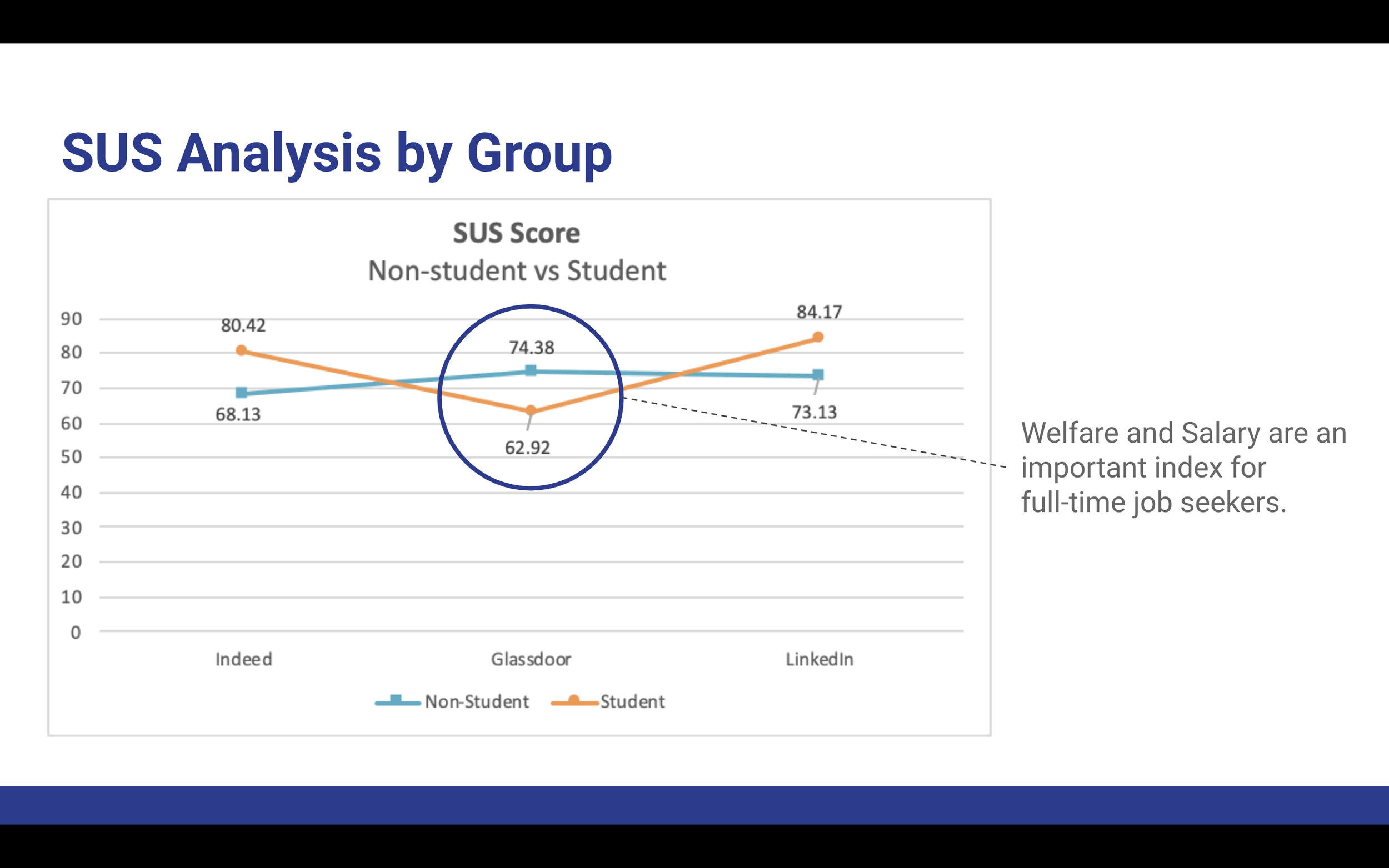
Quantitative analysis
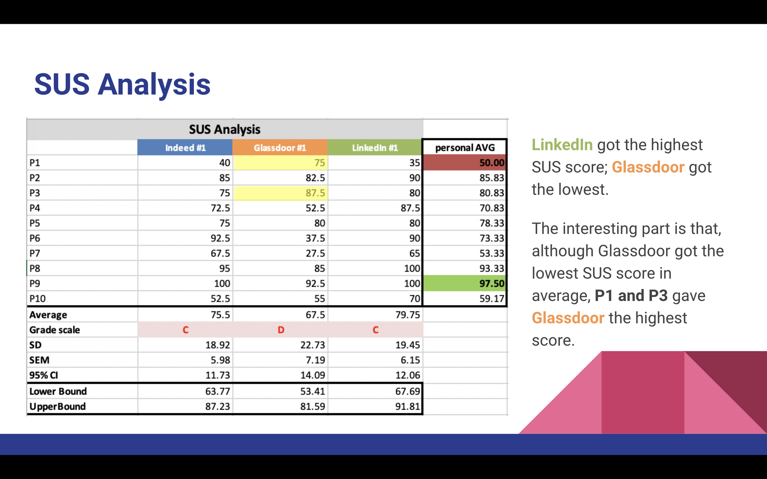
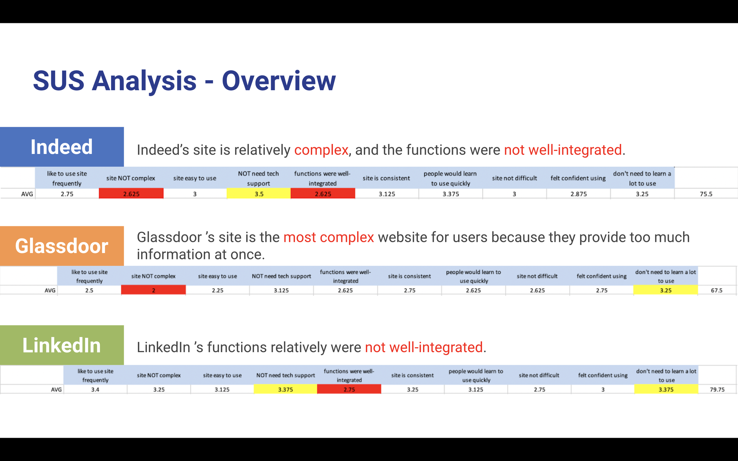
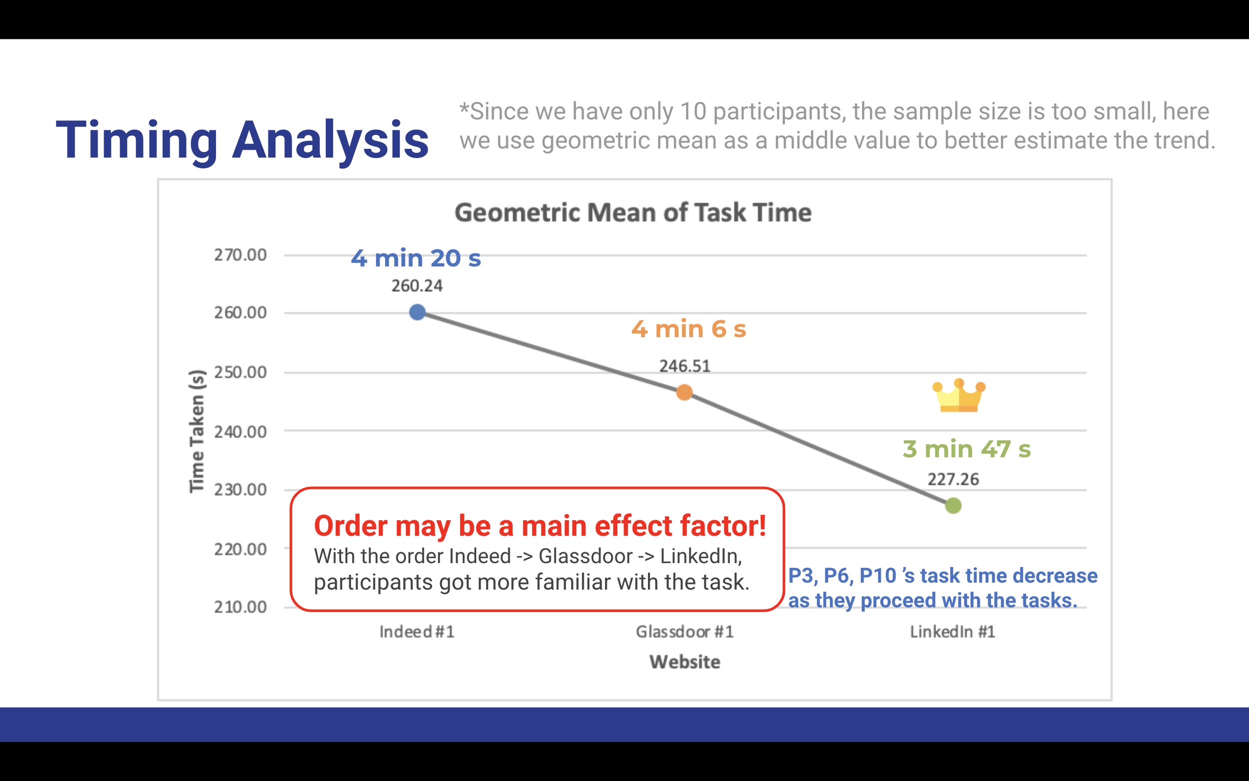
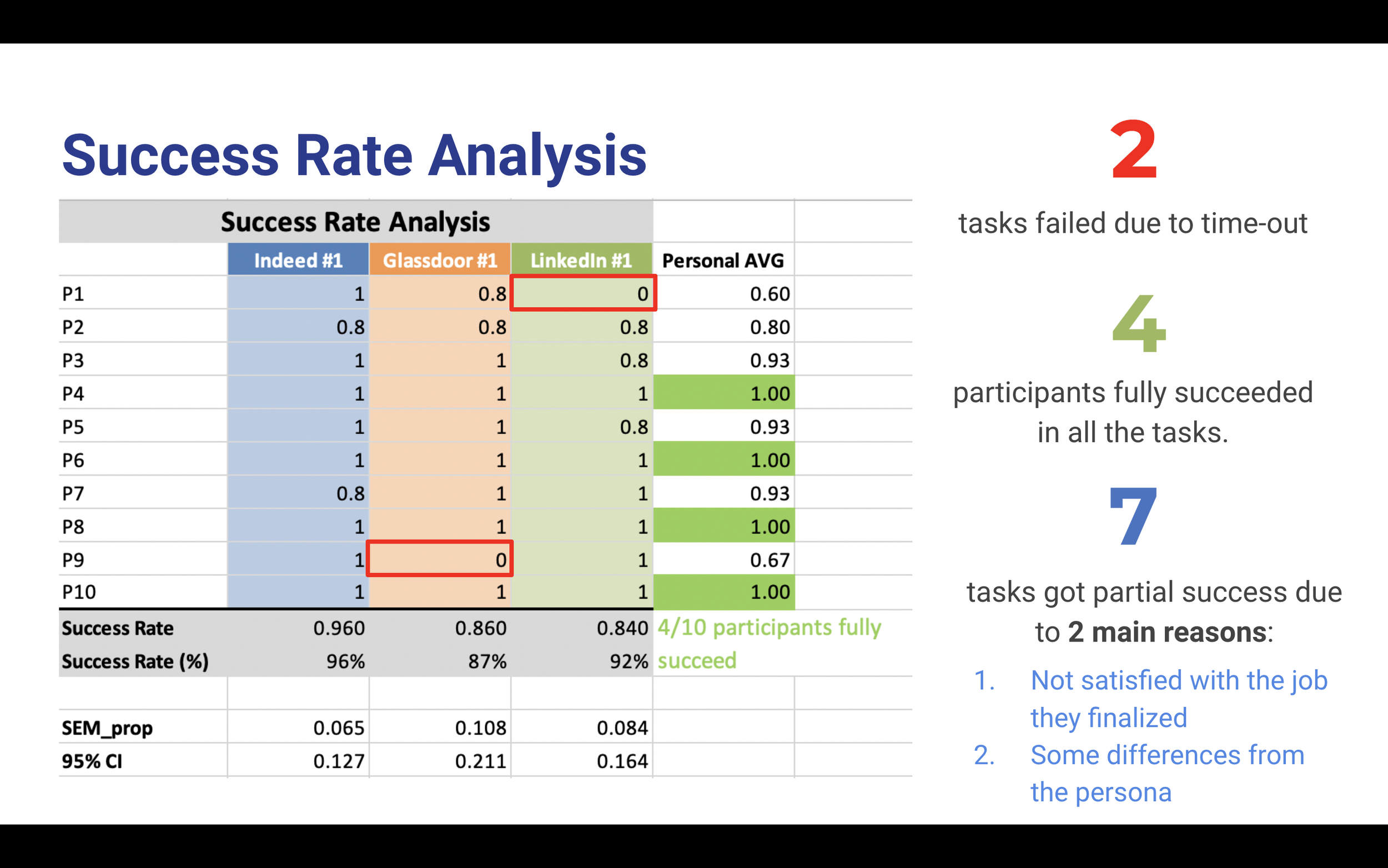
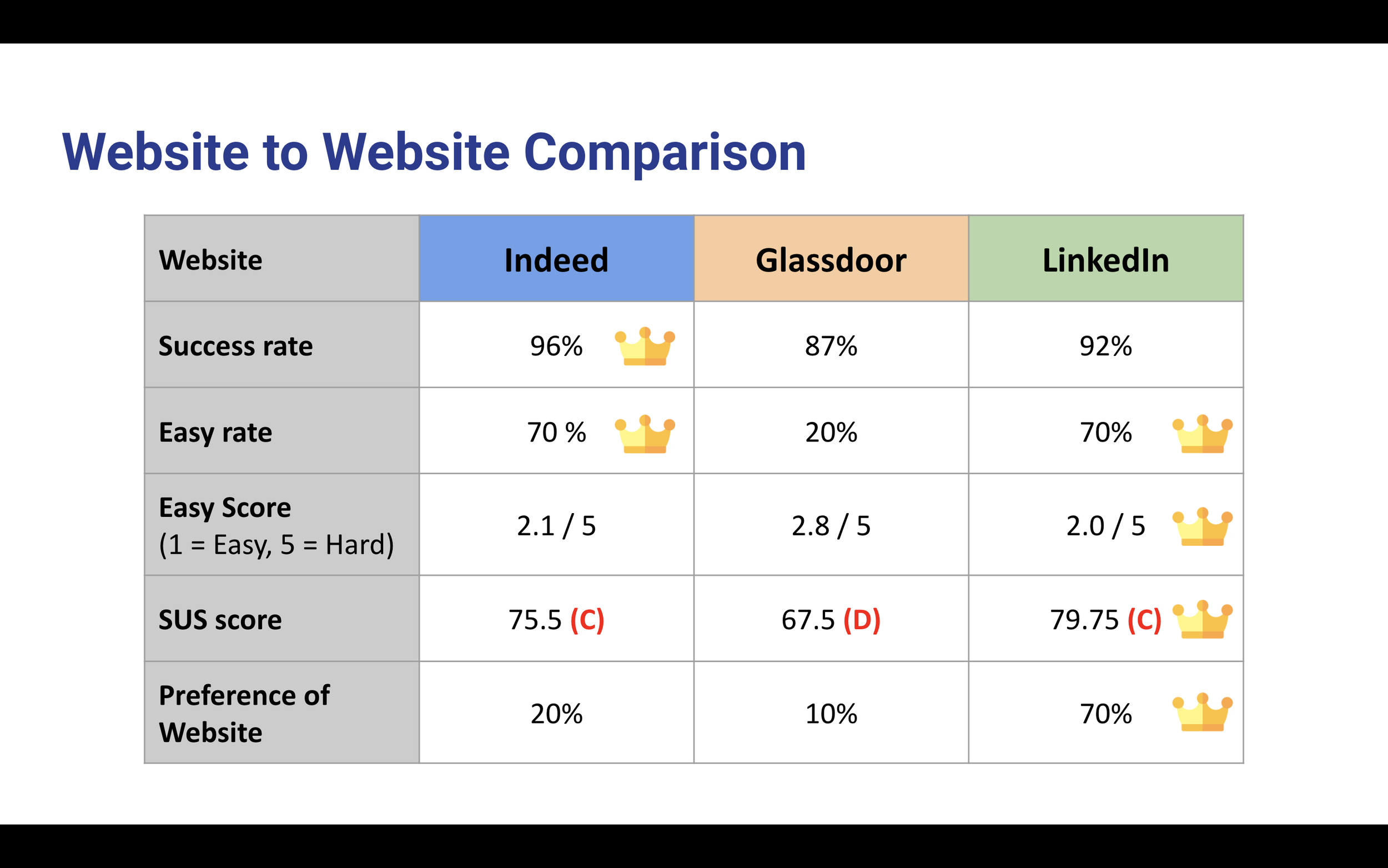
Statistical analysis was conducted on the quantitative data collected by the SUS administered to participants, as well as participant task timings and success rates. This allowed us to paint a more complete picture of the reasons behind participant performance and feedback.

Insights from usability testing
Positive feedback
Clean and minimalist UI (no clutteredness/info overload)
Filters are conspicuous & intuitive to use
Skill-set filters are a differentiator - not present in competitor sites
Search results not locked behind a login/signup wall - could lead to user frustration and site abandonment otherwise
Negative feedback
Search results do not match filters selected i.e. when users select a job type (internship), full-time positions are still offered in results
Job description can be organized better - a lot of information packed into a small card on the site
Improvements can be made to filters - accuracy, completeness, made more user-friendly
Suggestions for improvement
Allow selection for multiple options in filters given (multiple company preferences, location preferences)
Ensure that search results match what users select for in filters
Allow a sliding range instead of static options when it comes to preferred salary amount
Takeaways
-
Randomize order in which participants test out sites
Avoid order bias - respondents tend to favor objects because of their position in a list or sequence. Objects in the front and back tend to be more memorable
Increase number of participants in our usability test - gain more statistically significant insights with larger sample size
Persona - participants struggled with the amount of information they were offered. We should make it more concise so as not to overwhelm participants with information that they feel obligated to use in the user testing
-
First experience with a full-fledged UX research project for me
Became familiar with the research process and methodologies (benchmarking, heuristic evaluation, testing moderation etc.)
Preparedness - technical checks
Often overlooked but a crucial part of of the usability testing process
Imperative to ensure that participants’ equipment is functioning properly & compatible with what we are having them user test
Also provides the opportunity for participants to ‘warm up’ to the process and for researchers to initiate rapport with participants, making the actual user testing experience less intimidating