Q2 User Experience Research Internship
Over the summer of 2022, I was the UX Research intern at Q2 Software Inc., a financial experience company dedicated to providing digital banking and lending solutions to banks, credit unions, alternative finance, and fintech companies in the US and internationally
Throughout the internship, I took ownership of a summer-long intern project, took part in all research planning meetings & usability testing sessions. I also underwent trainings on the UX research process at Q2 - including recruitment, survey creation, user testing moderation, data analysis and more.

Intern project: Research reporting templates
At Q2, UX designers are responsible for the user experience domain of their own projects, sometimes in collaboration with each other or with product owners. The status quo has been that whenever a UX project needs to be presented, UX designers create a research report presentation from scratch, all while balancing a multitude of other responsibilities.
This can be tricky when deadlines loom, and I learned that this became a problem area - the research report creation process was tedious, an inefficient use of time, and lacked standardization across the board.
In my initial conversations, I learned that this process took up to a full work day to complete satisfactorily, which was quickly becoming unfeasible due to the increasing amount of projects that designers were working on at any one time.
To alleviate this issue, I set out in search of a solution that would prioritize lightening the workload for UX designers at Q2, so that they have one less aspect of their UX project to balance on their plate.
I devised a research plan and took ownership of this project as part of my internship throughout the summer at Q2, all while having the responsibility of a full-fledged UX Researcher at Q2. The plan was as follows:
Existing report review & affinity mapping
Stakeholder interview & data analysis
Focus group feedback & iteration
Final deliverable, presentation to C-suite
My goal was to
Create a set of versatile research templates to be used by stakeholders to present research reports
‘Building block’ elements that stakeholders can use or remove as necessary to customize the presentation according to content & audience
To standardize the output of research report presentations across the UX team at Q2
The final deliverable is projected to save the company over $40,000 annually by streamlining the research report creation process.
To start this project, I wanted to better understand the general structure of how research reports are presented at Q2. To do this, I reviewed past research report presentations that were given across a multitude of audiences. What were the common aspects that people included across all the reports? Those were essential information that needed to be included in the template. What stood out to me as nice-to-haves? Those could be included as an option to make a presentation more informative, but also should be omitted if there is a time crunch.
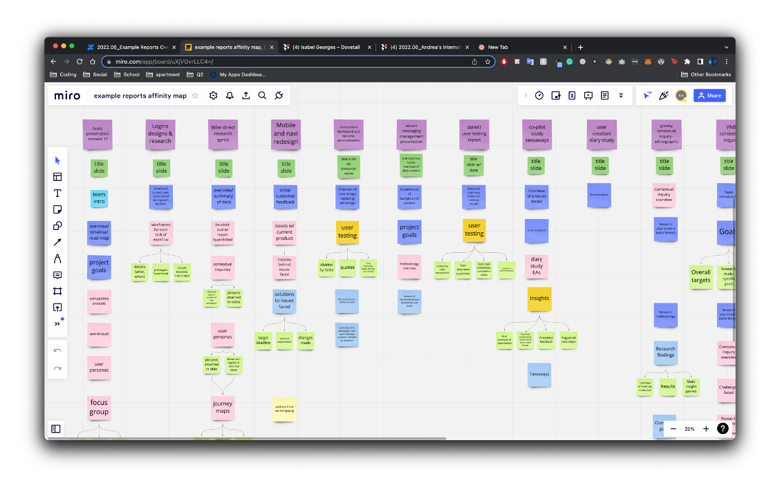
To help me better visualize the answers to these questions, I conducted an affinity mapping exercise by color-coding different sections of each research report. Placing them side helped me prioritize sections to include in my final research report template deliverable. Through this exercise, I was also able to develop lines of questioning & further investigations that would eventually be part of my stakeholder interviews in the next step.

Existing report review & affinity mapping
Stakeholder interviews & data analysis
In order to fully understand the needs and wants of the users I was creating this research report template for, I decided to conduct stakeholder interviews. Since the research reporting template would be mainly used by UX designers at Q2 when they present their projects, I focused my stakeholder interviews on UX designers, managers, and directors, and conducted about 15 interviews in total. In my interviews, I asked them about their pain points during the research report creation process, their methods of doing so, what the ideal structure of a research report looked like to them, how they adjusted their presentations to suit different audiences and so on.
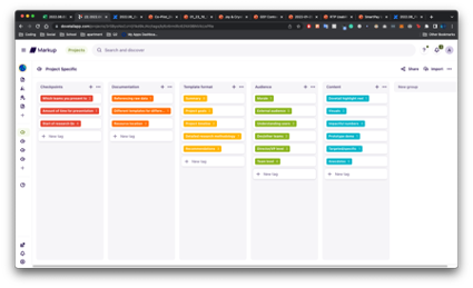
I then used Dovetail, a research repository tool, to conduct thematic tagging on the qualitative data obtained from these interviews. I used these findings to inform my initial working prototype of the research reporting template. Among the many insights obtained during the stakeholder interviews, one that stood out to me was the fact that the content of the research report varied in technicality according to the audience and time constraint allowed for the presentation. Thus, instead of one singular ‘standard’ template, I would include ‘building block’ elements that could be included as needed, allowing for more personalization according to the nature of the presentation.


Focus group feedback & iteration
I wanted to obtain constructive feedback on my prototype from my stakeholders - after all, I wanted my users to be an integral part of the conversation every step of the way as I was bringing this project to fruition.
To do so, I decided to bring my prototype to Design Studio, a weekly meeting for the Q2 UX design team to come together and discuss ideas and solicit design feedback, something I was wanting to do. There were about 7-8 participants in the focus group, which was perfect as it was a low-stress environment for everyone to contribute their thoughts and opinions towards the template prototype.
The way I conducted the focus group was to go page by page in the template for participants to first offer their two cents on the page of discussion, then when everyone was done, I’d bring up questions that I had, or alternative designs that I had on hand for the UX designers to select from.
This focus group session ended up being incredibly helpful for me to go in and tweak various aspects of my work. An additional concern that transpired was the fact that as UX designers, my stakeholders weren’t very familiar with research jargon and methodology, which became an issue when they had to present said jargon or method. I ended up including a “frequently used research methods” section within the template for stakeholders to refer to and save them the effort to look the information up on their own.

Final deliverable, presentation to C-suite
Throughout the internship, I solicited feedback constantly while iterating on my research report template, including presenting to the entire UX team at Q2 where I received mostly positive feedback and some suggestions.
The culmination of my hard work at Q2 was a company-wide presentation. From my fellow interns all the way to C-suite executives, everyone gathered in support of this year’s cohort of interns. It was extremely nerve wracking to say the least, but I was also really excited to learn about what other interns did over the summer and to represent the UX team while presenting to the wider Q2 community. The presentation was received incredibly well and everyone was unwaveringly supportive
While I managed to accomplish the goals I set out to achieve, with more time, I would ideally want to conduct an ethnographic observation session with my stakeholders to capture pain points and sentiments that would otherwise not have come up during my other user feedback sessions.

Project takeaways
Feedback is crucial - I was encouraged to and learned about the value of seeking regular feedback. Throughout the project process, I was constantly seeking feedback from UX designers, managers, and researchers to ensure that the final deliverable would successfully meet their needs.
Confidence is key - As an introverted person, staying within my comfort zone wasn’t an option during the internship. My team helped me grow in confidence as a UX researcher, encouraging clarification when in doubt. The open-door/collaborative culture of Q2 as a company meant that I was able to learn and grow meaningfully from the diverse backgrounds and expertise of the Q2 UX team
Establish project & time management early -Taking on a project right at the beginning of my internship meant that I would have a lot on my plate, in between participating in weekly meetings & usability testing sessions. I took the initiative to establish a Gantt chart/timeline for myself so that I knew I’d stay on track, and it became an integral part of the project’s success.
Other intern responsibilities:
In addition to my internship-long project, I also took on the responsibilities of a full-time UX researcher at Q2. This included participating in all research planning and team meetings, attending and being primary notetaker for usability testings, performing qualitative data analysis, presenting at research report readouts, as well as any and all ad-hoc duties that came up for the duration of the internship.
I also received trainings from the senior UX researchers on my team on crucial aspects of the UX research process such as participant recruitment, crafting effective surveys, research session moderation etc, and this made me a stronger UX researcher overall.
Usability testing at Q2
As primary notetaker for the UX Research team for most of the usability testings conducted during my time at Q2, I was in charge of recording task metrics like success rates, time on task, first clicks, and other pertinent information as required.
I helped conduct thematic tagging of usability testing transcripts to identify insights in Dovetail, a research repository tool. Insights gathered helped to inform the research report that, together with quantitative information, is later presented to the project owner, usually a UX designer, and other stakeholders
I played a part in presenting qualitative & quantitative data obtained from usability testing to stakeholders (product managers, designers etc.)
Notetaking
Data analysis
Research report readout
Get to know my time at Q2!
What has been your most valued takeaway from the internship experience?
My most valued takeaway from this experience has definitely been the hands-on learning I got to participate in. My coworkers used past and current projects to train me in various research methods performed at Q2 UX research. For example, participant recruitment - I didn’t know that there would be so many logistics going into something as straightforward (to me at least) as participant recruitment. There were budgetary constraints to dance around, participants had to be vetted carefully to make sure that they were our target demographic, and despite our best efforts, we met with unexpected road bumps during actual usability testing that we had to work around. Watching my coworkers make split-second decisions to adapt to dynamic circumstances during user testing, based off their prior experience was also another great learning opportunity - I got to understand the rationale behind each of those decisions.
What connections have you made during your time at Q2?
As part of my onboarding process, I had the opportunity to interview most members of the Q2 UX team, from designers, to UX managers, to the UX director. Getting to hear about their career trajectory as well as the words of encouragement they had to share was immensely meaningful to me. I also had the opportunity to learn more about their individual roles at Q2 and the value of the work they do in tandem with us researchers, product managers, developers and so on.
In addition to working with the UX team, Q2 sponsored a week of intern networking, and I got to meet all my fellow interns from around the country here in Austin. I enjoyed hearing about their respective roles in the company, what they worked on, and their journeys thus far. My fellow interns had a wide diversity of professional and life experiences.
I can confidently say that the networks I have made at Q2 have helped me grow personally and professionally, which I am incredibly grateful for.
Why did you choose an internship experience over a summer vacation?
After being thoroughly well-versed with the basics through classes, I wanted some industry experience so I could apply the knowledge I gained in the classroom to real-world settings. Throughout my time at Q2, I was a part of each step of the research process - from research planning meetings to participant recruitment to survey creation to usability testing. I collaborated with my fellow researchers and UX designers on their research projects, and it was immensely gratifying watching a project’s research process that I was a part of since its conception come to fruition.
Why Q2?
Q2 prioritizes its interns - instead of being delegated mundane tasks, interns are effectively an honorary full-time member of their team during the length of their internship. They take on projects that make real-world impacts on the company.
Throughout my time at Q2, I really appreciated its open-door policy - being completely new to Q2 as well as the world of fintech, my first couple of weeks felt like drinking from a fire hose. However, my team as well as the greater UX team at Q2 were unwaveringly supportive, and I was encouraged to ask as many questions and explore as many avenues as I needed to succeed in my role. In fact, one of my first assignments at Q2 was to conduct an interview with members of the wider UX team - designers, managers and directors alike. This helped me get to know my colleagues on a more personal level, as well as learn about the career path that led them to where they were today.
In addition, a well-rounded intern program was also part of our curriculum - we met with members of the C-suite who came by weekly to talk to us about their role at the company as well as professional and life advice. My internship culminated in an ‘intern week’, where we got to take part in fun company-sponsored events like TopGolf, as well as a Q2 stadium tour, all while networking and making lifelong connections with our fellow interns.