Workbee
Workbee aims to be the premier coworking space marketplace for hosts to rent out both public and private work spaces to tenants. Our marketplace will include specialty work spaces that may offer professional equipment, and allow the hosts to make their own rules. This platform is geared towards providing a flexible solution for individuals such as students, freelancers, and remote workers.
Process
As a team, we decided to use the Design Thinking process to conceptualize our app from start to finish. The five stages of Design Thinking we followed were:
Empathize
Define
Ideate
Prototype
Test
Empathize
We used Miro, a whiteboarding tool, to brainstorm and come up with novel ideas for our app. App ideas ranged from parking availability, carpooling, hobby exchange, and even an artwork trading marketplace. After deliberation, we settled on a coworking marketplace concept after observing how remote workers, displaced from their workspaces, were in need of conducive, flexible and affordable alternatives to complete their work.
Define
After settling on our coworking marketplace concept, our team and I set out on our Define phase - to perform user research prior to designing our app. This was so that we could properly identify the needs and wants of our target demographic, as well as gain some insights into current thoughts, attitudes and opinions on the concept of coworking spaces.
In addition, we laid out our project plan and timeline so as to ensure that we would stay on track with project management in order to meet the deadline given.
-
Market Research
We conducted market research in order to understand the demands for the gap that our app would fill in the market. Our research found that after the onset of the COVID-19 pandemic, people overwhelmingly preferred the flexibility and comfort, in addition to safety, that remote work offered in comparison to in-person work. Because of this, we doubled down on our idea of a cohesive coworking marketplace app that let users choose and reserve spaces according to their comfort, amenities required, and budget.

-
Competitive Analysis
We analyized the user experience and visual interfaces of competitor apps such as AIrbnb, Peerspace, Turo etc. Doing so helped us compare the pros and cons of features in each app (subscription model, information architecture, reservation process etc) and ultimately facilitated our decisions in which features we would implement and which we would leave out in order to create the best user experience for our Workbee app.

-
Stakeholder Surveys & Interviews
To find out more about our target users, both on the host and tenant side, we first conducted user surveys on Qualtrics in order to capture user insights on remote working in the context of the COVID-19 pandemic, as well as opinions on coworking spaces. Concurrently, we performed verbal (in-person/Zoom) interviews with established landlords and property rental owners in order to ensure that our app would properly cater to their needs/requirements as hosts who rent their spaces out.

-
Affinity Mapping
From the results of the previous stages (market & competitive research, stakeholder interviews), we came up with an affinity map to organize gathered data and observations. This helped us understand which stakeholder perspectives to take into consideration moving forward into the ideation process.

-
How-Might-We's
For the final stage of our define process, we came up with a series of ‘How Might We’s’: a simplification of known challenges or pain points faced by our potential users & competitor apps so that we are able to tailor our Workbee app to best suit the needs & wants of our end-users.

Ideate: User stories
To kickstart the Ideate stage, team members and I came up with user stories using insights from our Define phase.
For example, “as a remote worker, I would like to find a quiet space where I can complete professional work and potentially take virtual meetings in.”
These goal-oriented statements helped us narrow down exactly what issues we were looking to solve with our Workbee app.
Ideate, Prototype, Test: Wireframing
Using our user stories as guidelines, we started to brainstorm what our app would look like, and what features it should have. Ideas were thrown around and slowly, our low-fidelity wireframes began to materialize.
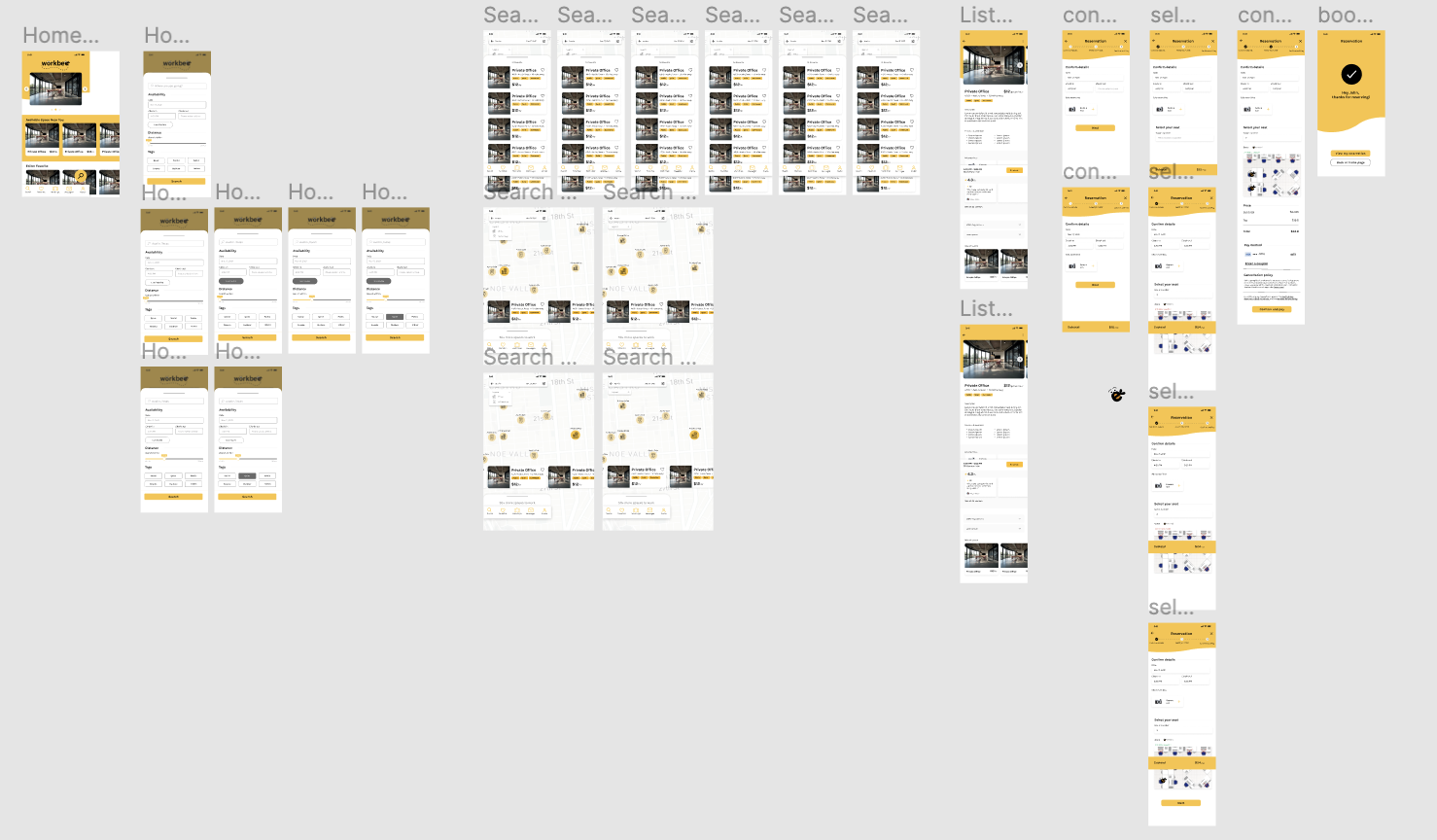
We used pen and paper for our low-fidelity wireframes, as it facilitated team discussion & collaboration, and the process was quicker than making wireframes on Figma or Adobe XD. We sketched out numerous different screens according to a single user flow, and settled on a common skeletal framework that would guide our medium and high fidelity wireframes.
This was also the stage where we started to think about the name of the app. We wanted a bee theme as bees symbolized diligence and teamwork, both of which were crucial aspects of remote work. After a quick deliberation, the name ‘Workbee’ was chosen.
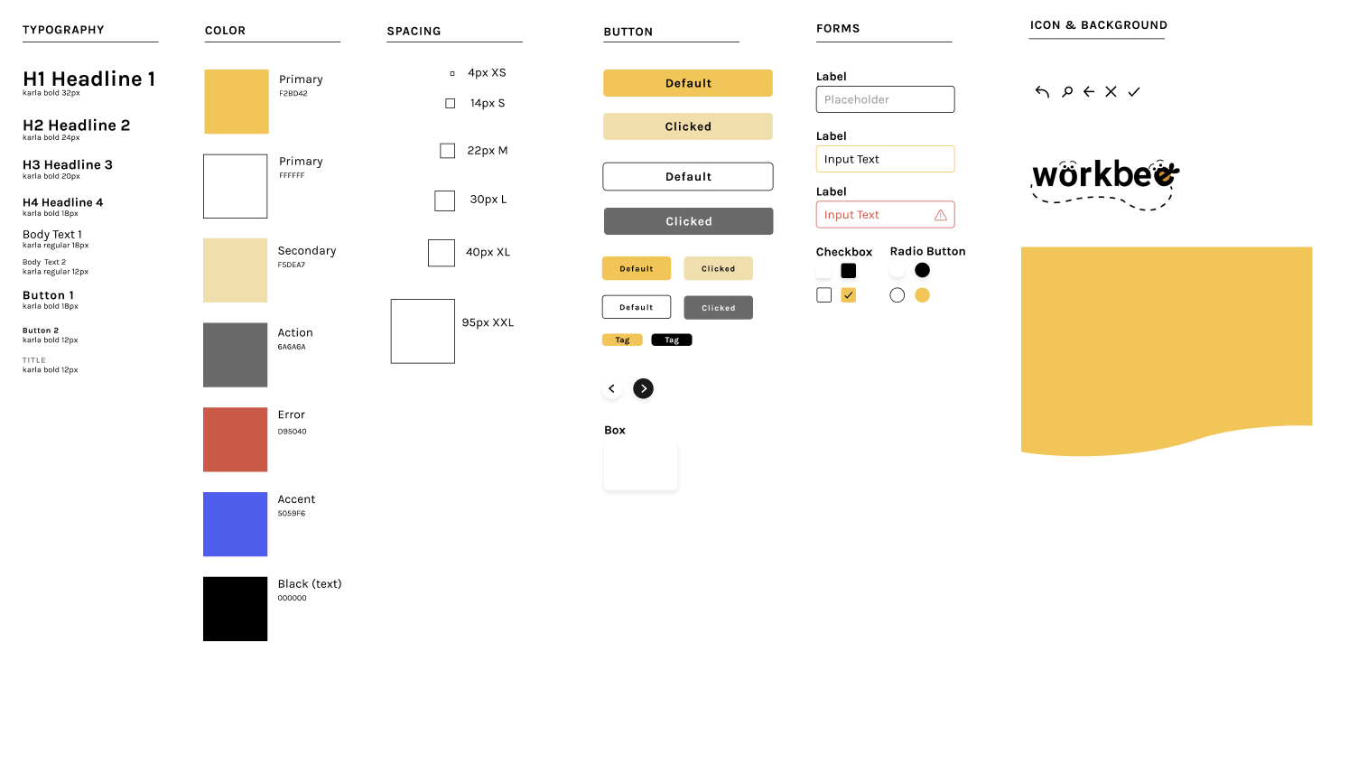
The color scheme and design system were created soon after. This was to ensure cohesiveness as team members decided to divide and conquer, taking on the task of designing a few screens each.
In between each stage of wireframing, we conducted user testing both in-person and online via Usertesting.com in order to gather insights. We translated the qualitative data into iterations on our designs before moving on to a higher-fidelity wireframe.
For example, initial feedback for our medium-fidelity wireframes we received included a preference for seeing user ratings on the listings screen, and that users preferred to select a timeslot they wanted before seeing available listings instead of vice versa, among others. We added these features and more, then re-tested it for user satisfaction before implementing them into our high-fidelity wireframes.
This wireframing process was a repetitive loop of ideation, prototyping and testing, the last three stages in our design thinking process. We continued iteration and testing, and implemented features like a subscription model, reservations, and QR code check-ins.
Our final deliverable was an industry-standard professional report, and team members and I presented our app to program alumni, now industry experts.


Takeaways
-
Due to the time constraints we faced to turn our project in, we were not able to flesh out as many components of our app as we desired. If we could restart the process, we would:
Spend less time exclusively in the research phase i.e. work on Define & Ideate stages concurrently
Focus on the host side of the app as well instead of just the tenant side
Carry out more in-depth (formal) user testing in addition to informal and semiformal testing, in order to gain as much qualitative data about our prototypes as possible, iterate and test more than we did
We would improve the incentives our subscription pass offers in order to entice users to purchase it
-
This was one of my first formal UX experiences, and while it felt like being tossed into the deep end at first, guidance by my professor and support from my teammates meant that I was able to quickly grasp and adapt to each aspect of the design thinking process. Through this process, I picked up UX best practices as well as technical skills in Figma, Miro, Usertesting.com, and honed my research and qualitative analysis skills. My background is in academic research, and it was invigorating to reuse some methods as well as learn some new ones during this project. It further solidified my aspiration in entering the UX research industry, as I thoroughly enjoyed the competitive, legal & market research, and testing phases of this project.
UX is a collaborative industry, and even though my peers came from different professional, academic, and even cultural backgrounds, I worked cohesively in a team, compromise, and support one another as needed. Project management skills were also improved upon as we had to complete the entire process within the span of a few months.


